Crafting seamless travel experience and driving 800% growth in revenue.
Tallink is an Estonian shipping company operating Baltic Sea cruiseferries and ropax ships between Estonia, Finland, Sweden and Latvia. It is the largest passenger and cargo shipping company in the Baltic Sea region.
Products: Tallink Silja Mobile Booking, Tallink Silja MyJourney
Type: B2C, E-Commerce, Travel Booking
Role: Visual Designer
Duration: 2015 – 2017
Expertises: UX/UI Design, User Testing, Video Editing
Outcomes: 800% growth in mobile booking channel, 1600% ROI, 90% approval rating, 200,000+ app download in first six months
Team setup and problem statement
In spring 2015, as part of the Qvik consultant team, I had the privilege of working with the largest sea ferry company in the Baltic region, Tallink Silja. We were tasked with integrating with the client’s internal development team of twelve to build the best possible trip booking experience. Eventually, the project expanded beyond just Mobile Booking to cover the whole customer journey experience as well.
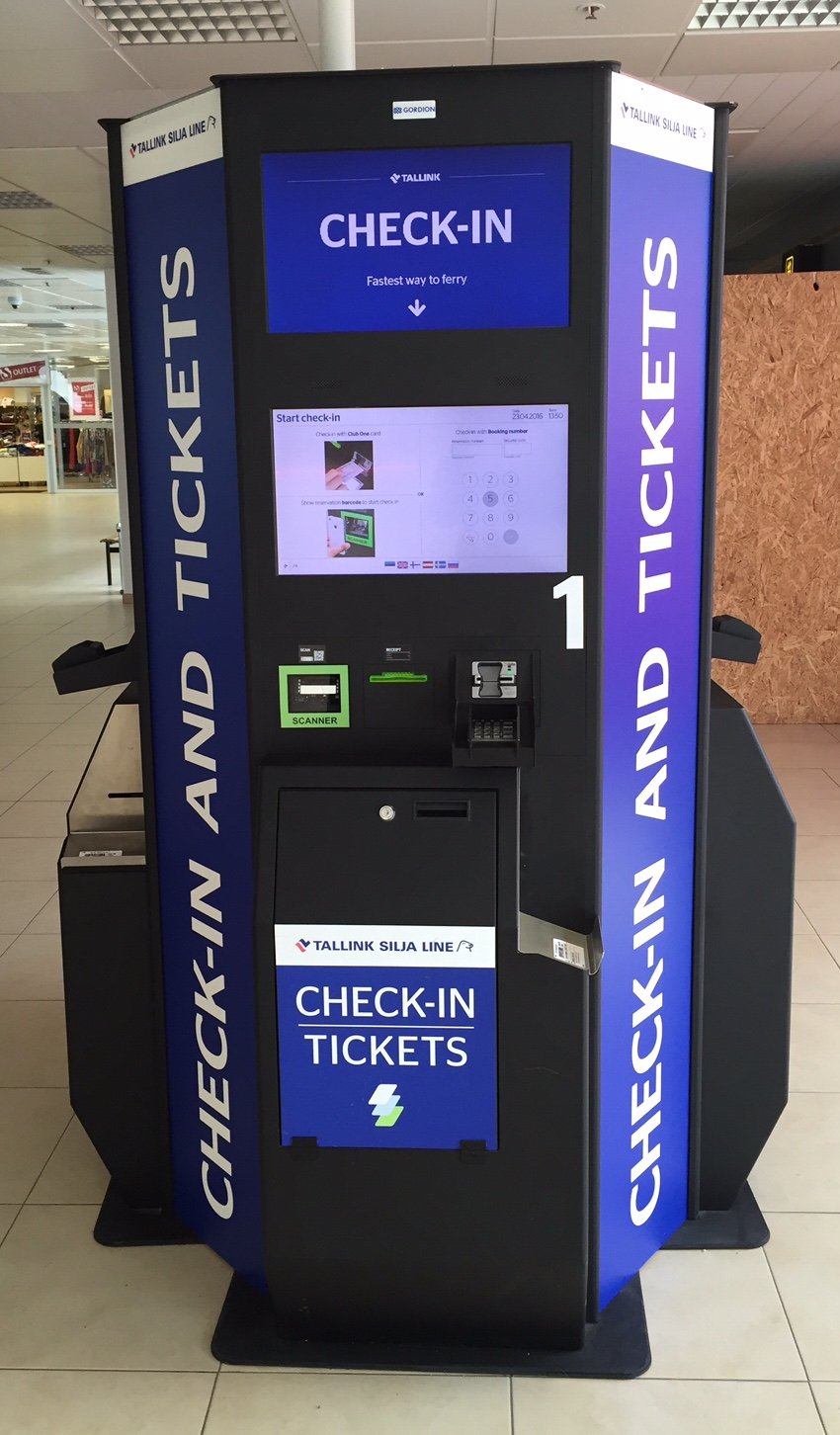
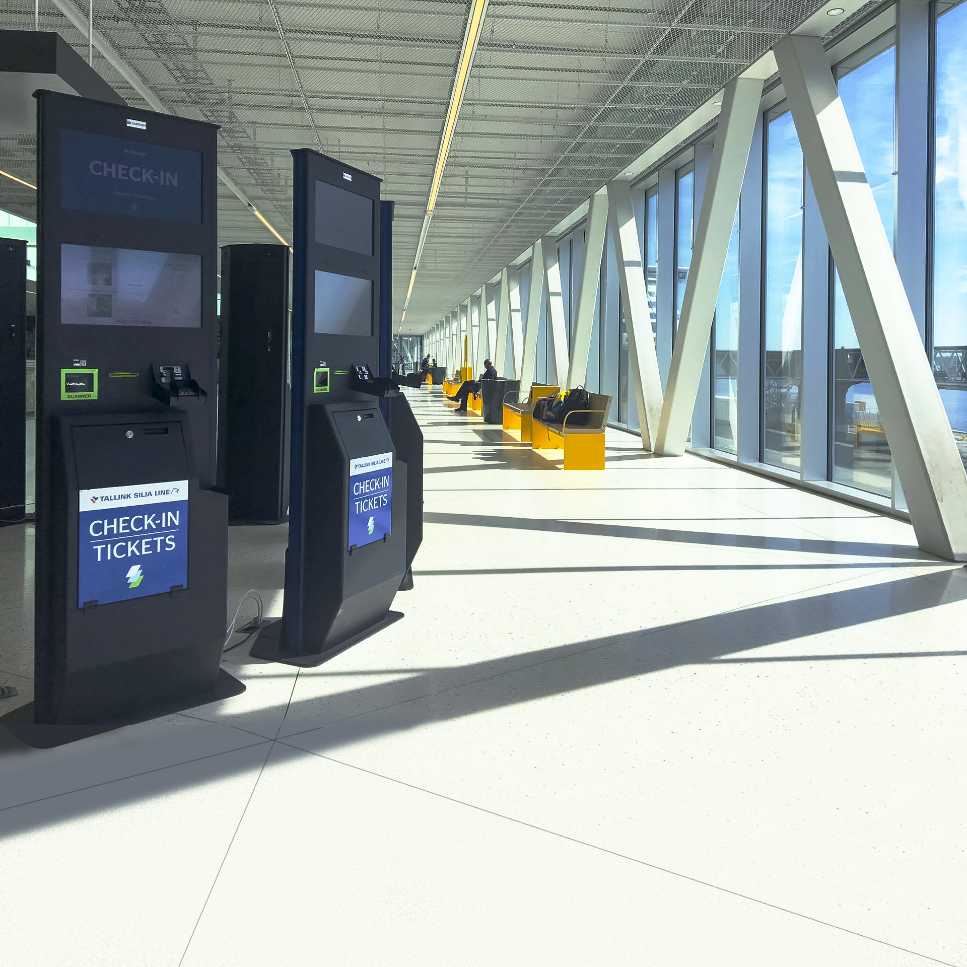
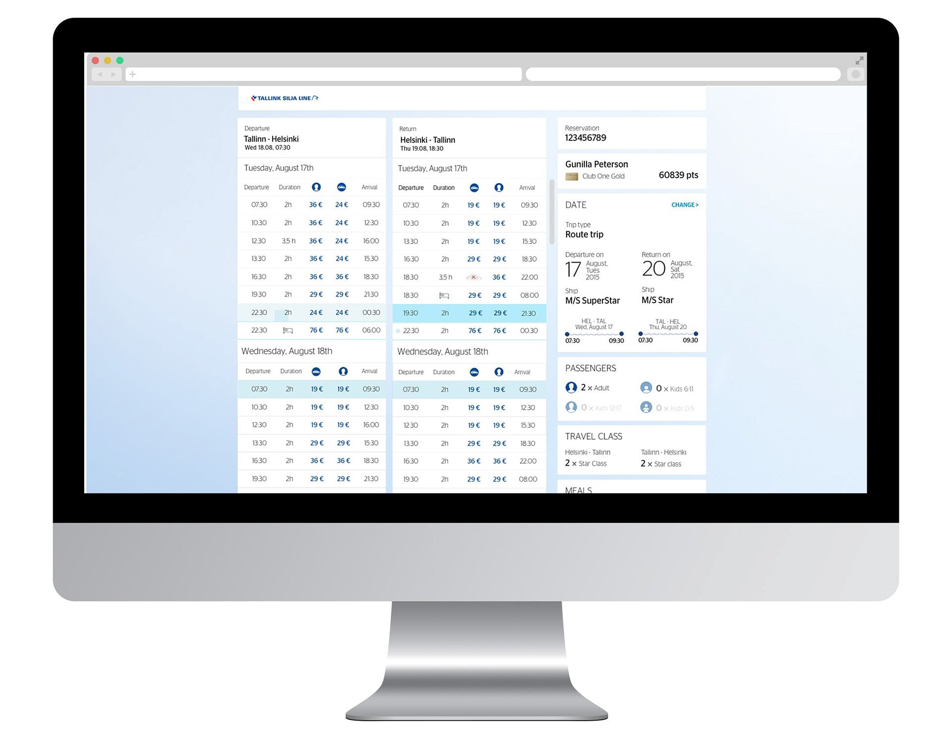
Prior to 2016, Tallink Silja only offered a desktop trip booking experience. Ticket confirmations were sent out in PDF files, and travelers needed to physically check in at Tallink Silja kiosks at the terminals before boarding the vessel. Similar trip experience across all available routes: shuttle services (Helsinki, Tallinn), and overnight cruises (Helsinki, Turku, Åland, Stockholm, Tallinn, Paldiski, Kapellskär). Depends on type of trip, passengers often need different type of information throughout the whole journey, however all interactions were done either via the outdated web booking interface or direct communication with staff.
"Mobile Booking" was selected as a pioneer project and testbed for the company to experiment with new design ideas. The entire booking process was reevaluated and redesigned with a focus on user experience, based on UX surveys and customer journey research.
Streamlined Travel Booking Experience and beyond
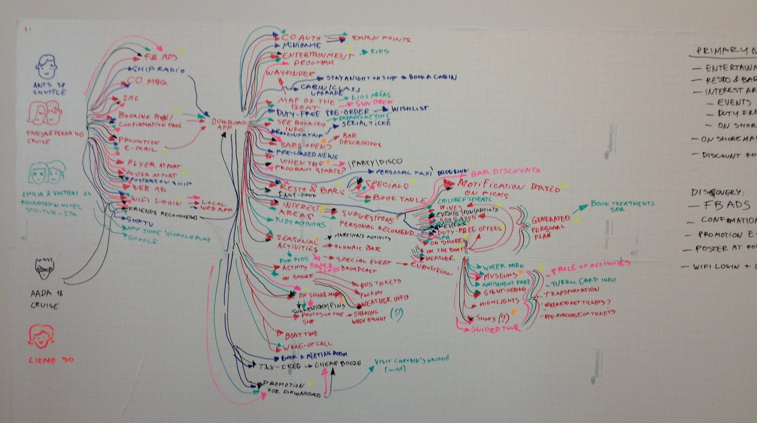
Although ticket booking was the centre piece of the journey, our team didn’t want to only focus on solving the booking problems. We rather took a holistic view of the entire passenger journey experience, from idea planning, booking tickets, arriving at the terminal, participating in onboard activities, disembarkation, and engaging in on-land activities. All pain points were identified, and every touchpoint was analyzed, with an emphasis on user-centric mobile experience. We concluded that the north star for the design was user-friendliness and accessibility of all Tallink Silja services for a smooth trip experience.
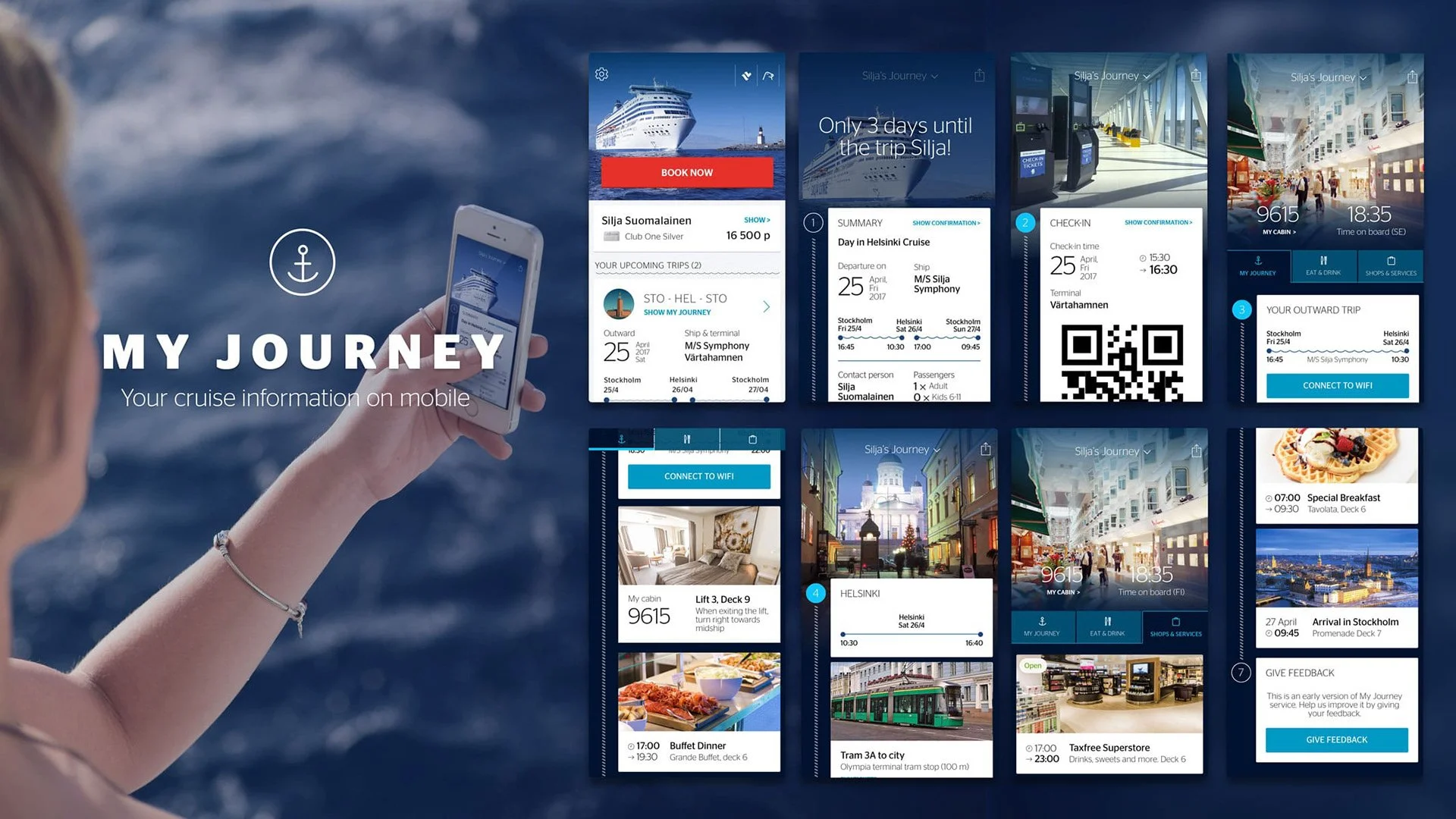
Mobile Booking was introduced first as a mobile app and web platform. Then, the desktop booking system was revamped, followed by the development of tailored onboard guide mobile applications, a personalized loyalty program, easy-to-use booking changes, and other complimentary services.
Now, customers could conveniently book tickets and complimentary services via the mobile app, check in online, or at automatic kiosks without queuing and need for a paper boarding pass. They also received personalized itinerary information in the app and push notifications reminding them of important action points or benefits.
As part of this project, my responsibilities included communicating with stakeholders to sketch out the visual design approach, working with UX researchers, and participating in the user research process.
The technical solution was a hybrid of a native wrapper (iOS/Android) and a mobile web platform (Angular). Along with newly available technology in the early 2010s like Push Notifications, Responsive Web Design, Password-less Single Sign On, QR scanning, and Apple Wallet integration. Thus, we truly believed we helped elevate the customer experience with Tallink Silja and become the market leader in the Baltic.
Design language and foundation
I was responsible for the overall appearance, UI elements, and motion of the service. At the same time, I was able to incorporate Tallink Silja's brand identity into these elements to create the company's first official design language. The mobile booking interface was well received, and its design patterns were adapted for use across the company's digital products.
Design principles:
Clarity
Usability
Consistency
Beauty
Tone of voice and content:
Simple yet subtle
Friendly yet polite
Communicative but not overwhelming
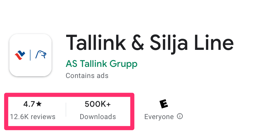
The Tallink Silja mobile reservation saw 800% growth in mobile channel revenue within 2.5 years of its release, and a 1600% return on investment within the same time frame. It received over 90% approval rating among customers in post-booking surveys and saw more than 200,000 downloads in the first 6 months. The service was a finalist (top 5) for the Best Consumer Web Service in the Grand One award in 2016, and won the award for Best Customer Experience in the Blue Arrow award in 2016.


